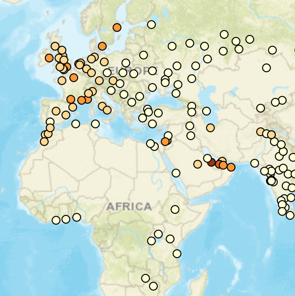
When I started at the Recurse Center, I had several vague ideas of projects I wanted to work on. A throwaway comment on the price of beer in Budapest inspired me to see if beer could be used as a cost of living metric. The first maps I found polled a single city per country, typically the capital or largest city, which seemed unrepresentative: everyone knows the cost of living is high in New York, Tokyo, or London. So I wanted to gather data by city, average it across various sources, and map it. Since beer is not globally popular, though (in Saudi Arabia, it's illegal), I decided to expand my analysis to coffee, which is widely available even in non-coffee cultures, and bread, since everyone needs something to nibble on with their beer. (In my household, we make some of our beer and bake some of our bread; we do not roast our own coffee.)
I collaborated with apettenati on the data scraping (Beautiful Soup) and cleaning (pandas) phase. We split up our data sources: DeutscheBank's survey of world prices, Expatistan, Numbeo, and PintPrice. Initially I made a proof-of-concept map in folium, but quickly realized I needed to switch to JavaScript, for a feature that restricted the number of markers based on the zoom level, to avoid overcrowding the map. So I tried Leaflet.JS and found it reasonably easy to work with. Folium had given me the idea for charts in popups, though, so I turned to Chart.JS to create those. I'm still not entirely comfortable in JavaScript but this project was a major step forward in my understanding. The payoff of having a snazzy visualization was surprisingly motivational (in direct contrast to the data cleaning phase, which was tedious beyond belief but also essential.)